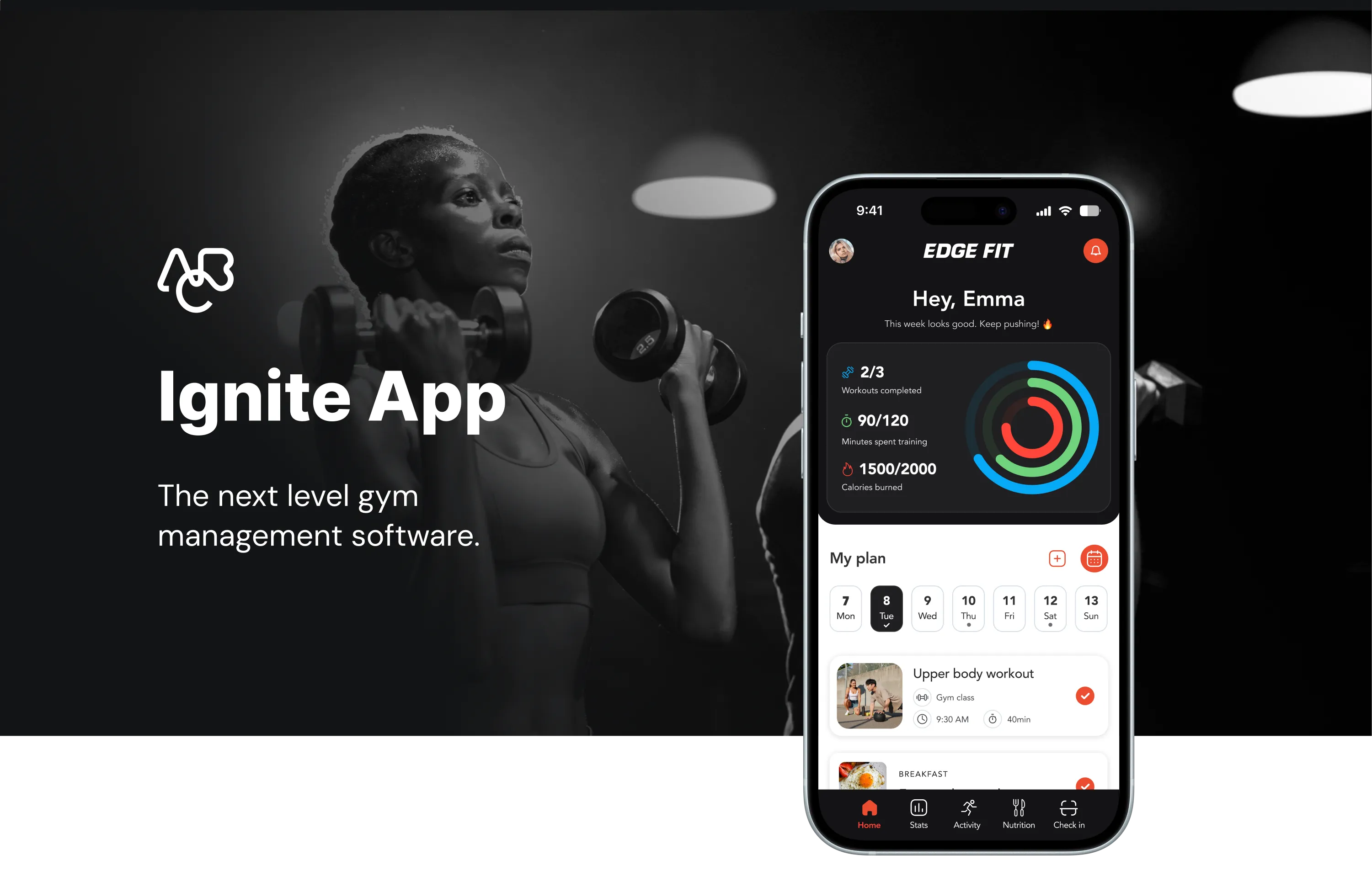
Reinventing
fitness.
The next level gym management software.
ABC Fitness aimed to redesign its app for various reasons. Primarily, the goal was to enhance user experience, stay competitive among technological advancements, modernize the design for visual appeal, and improve functionalities to boost user satisfaction and drive business growth.
The growing trend of sedentary lifestyles has sparked a stronger inclination toward exercise — and with it, a rising demand for a comprehensive fitness app that tackles the diverse challenges people face in maintaining a balanced, healthy lifestyle.
Drawing from insights gathered through app usage, there was a clear opportunity to enhance the user experience beyond simple workout tracking and calorie counting — providing personalized, motivating solutions for users with varying fitness levels, preferences, and health conditions.

Member Personas
Routine Lifers
Sticks to a consistent regimen
Wellness Lovers
Balances fitness, nutrition and mental/physical wellbeing
Fitness Explorers
Continuously seeks out new fitness programs, products and services
Casual Consumers
Fitness motivation is primarily event driven (vacation, wedding, etc.)
After analyzing four types of members and four types of business models, we've identified common needs that must be addressed in creating a universal app design.
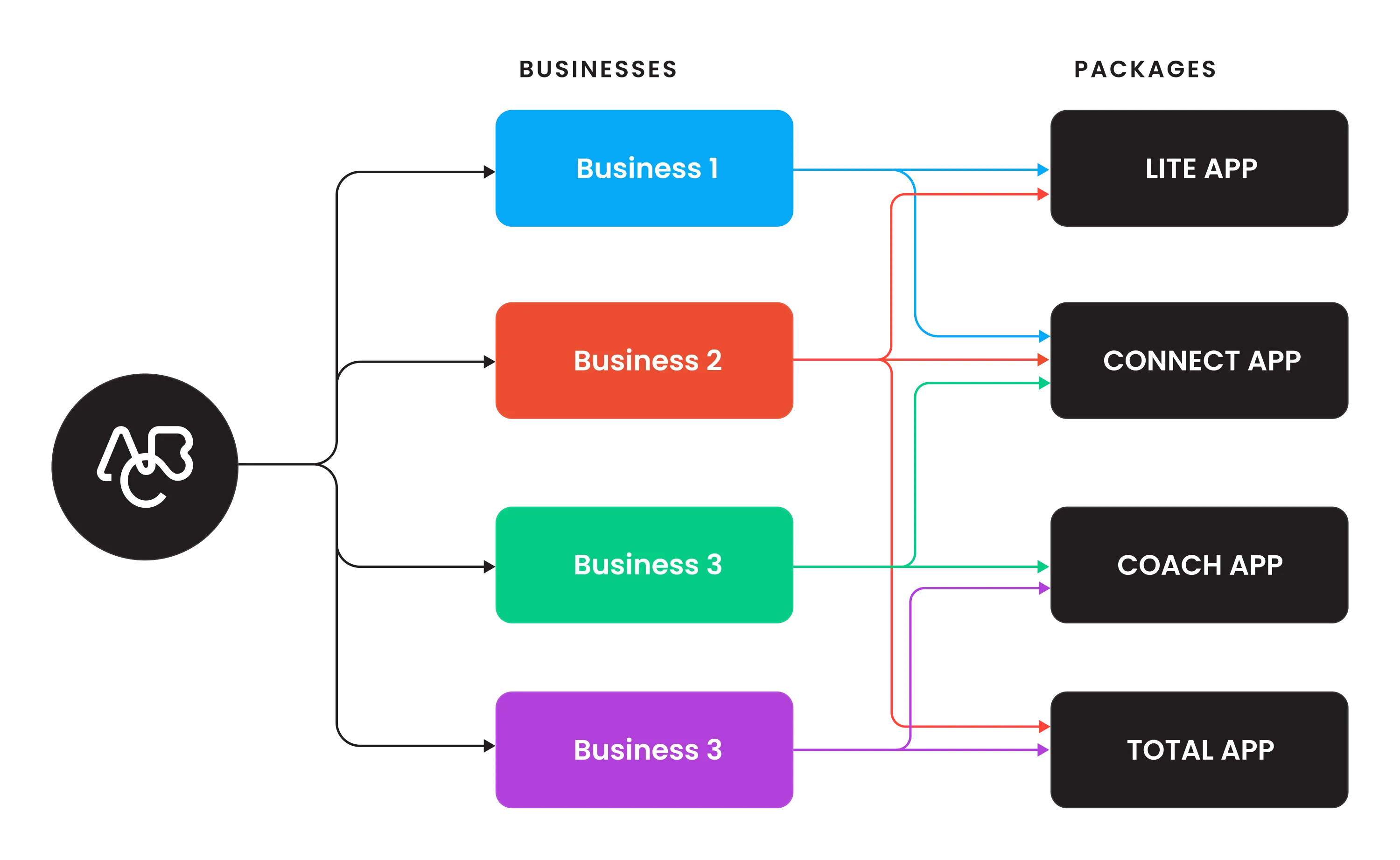
ABC packages and members
Likes to work out on their own, prefers gym
- Gym check-in
- Manage membership
Likes to work out on their own, prefers home/outdoors
- Gym check-in
- Class booking
- Manage membership
- Workout library
Needs guidance, prefers gym
- Gym check-in
- Class booking
- Personal trainer
- Manage membership
Needs guidance and freedom, mixed workouts
- Gym check-in
- Class booking
- Personal trainer
- Manage membership
- Workout library
- Mixed workouts
ABC Fitness presents four distinct packages for businesses to choose from, allowing them to tailor their selection based on their needs and the types of members they intend to target — one or multiple packages that align with their specific requirements.
Complete customization.
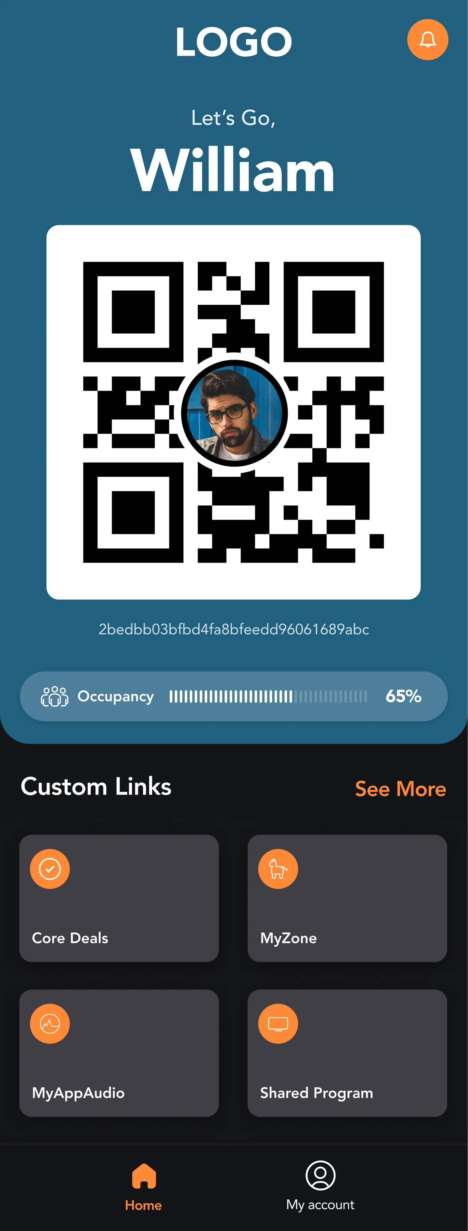
The main challenge in rebranding and developing the new design system was the need for complete customization. The priority in the MVP was ensuring that components function in line with any brand's style — requiring comprehensive guidelines for implementing the design system, especially around custom brand colors.
A vibrant, systematic and meaningful approach to color usage — designed to resonate with the app's mission to promote health and wellness. The system covers brand colors, greyscales, and semantic states (error, warning, success, info) across both light and dark modes.
Avenir — a geometric sans-serif by Adrian Frutiger (1987) — serves as the primary typeface, covering Display, Headline, Title, Body and Caption scales across three weights: Heavy, Roman, and Light.
A recognizable, highly simplified icon system. Icon content is constrained to a 20dp live area with 2dp padding, supporting six sizes: 20px, 24px, 40px, 48px, 64px, and 88px. Outlined style throughout.
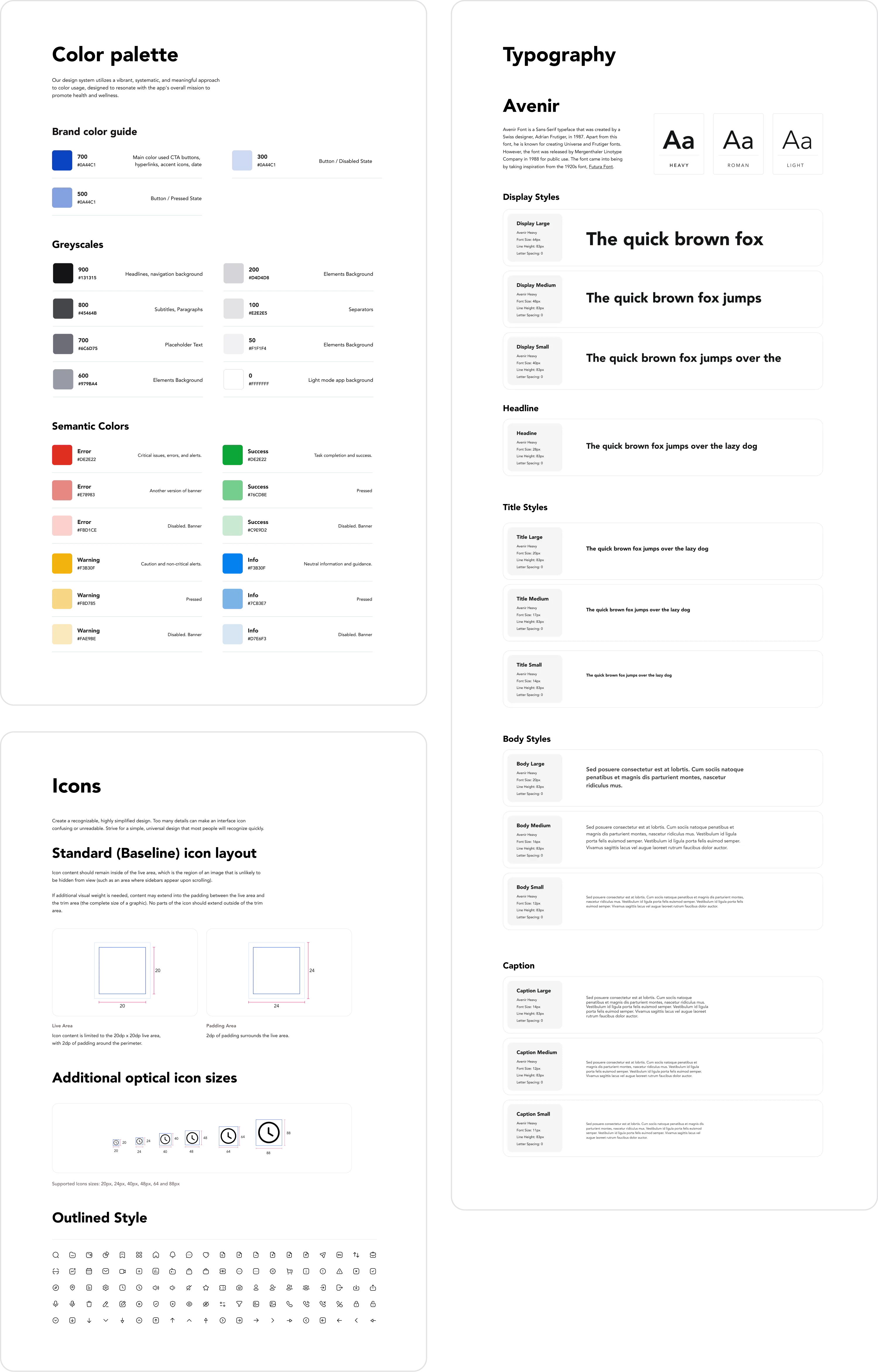
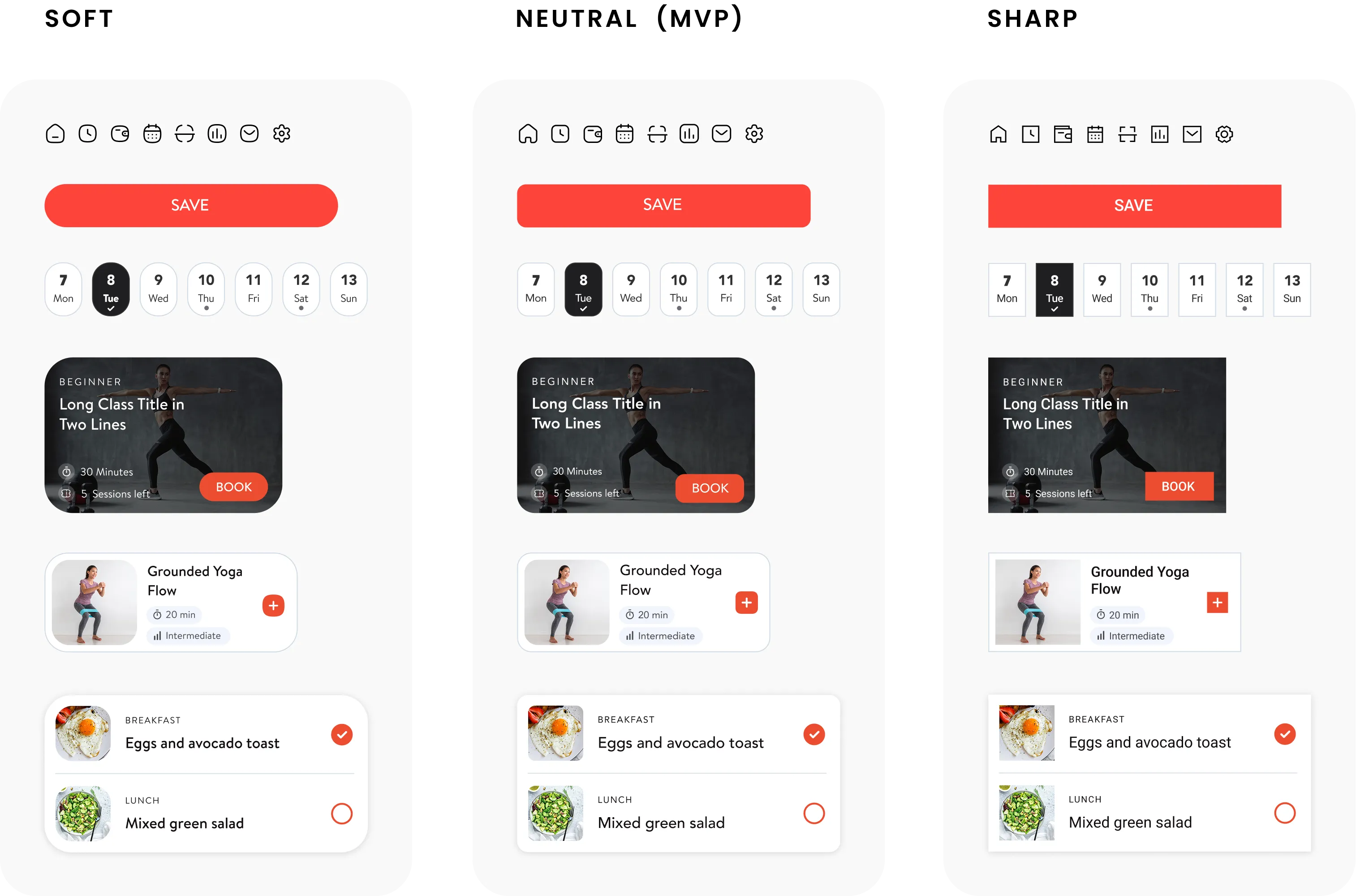
To align with each brand's style guide, all components needed to support both dark and light mode variations. Further stages introduced the "softness" style — allowing businesses to achieve an even more personalized app appearance through new icon styles, border radius, and typefaces.
Style Variants
Three visual personalities were defined for the design system, enabling businesses to fine-tune the app's look beyond just colour.
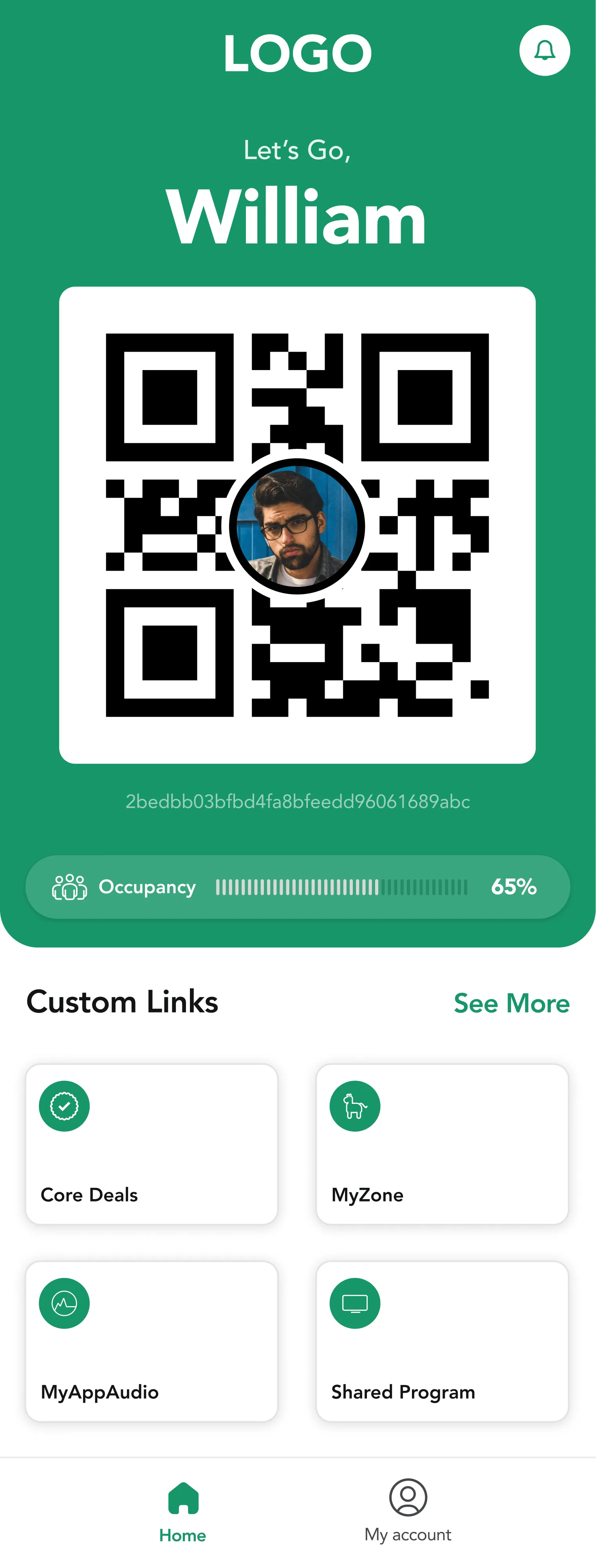
Rounded corners, gentle icons, softer typefaces — warm and approachable
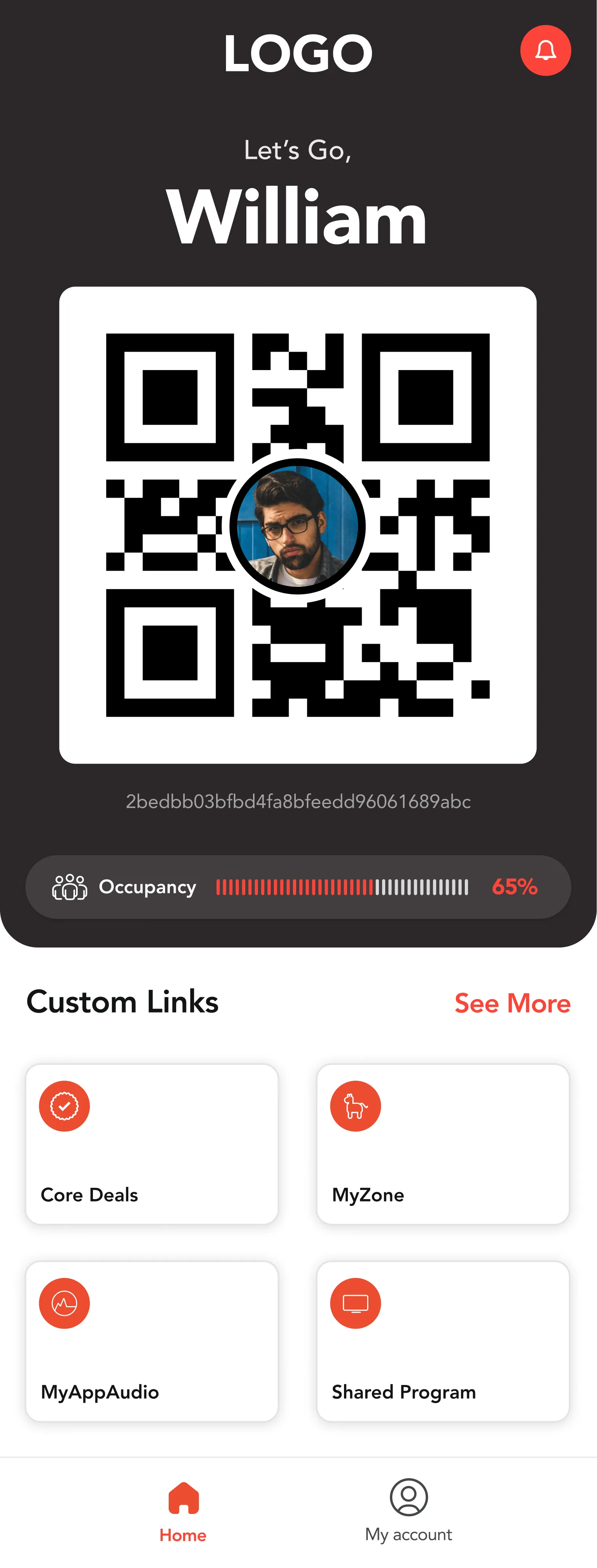
Balanced defaults — the starting point for all brand customizations
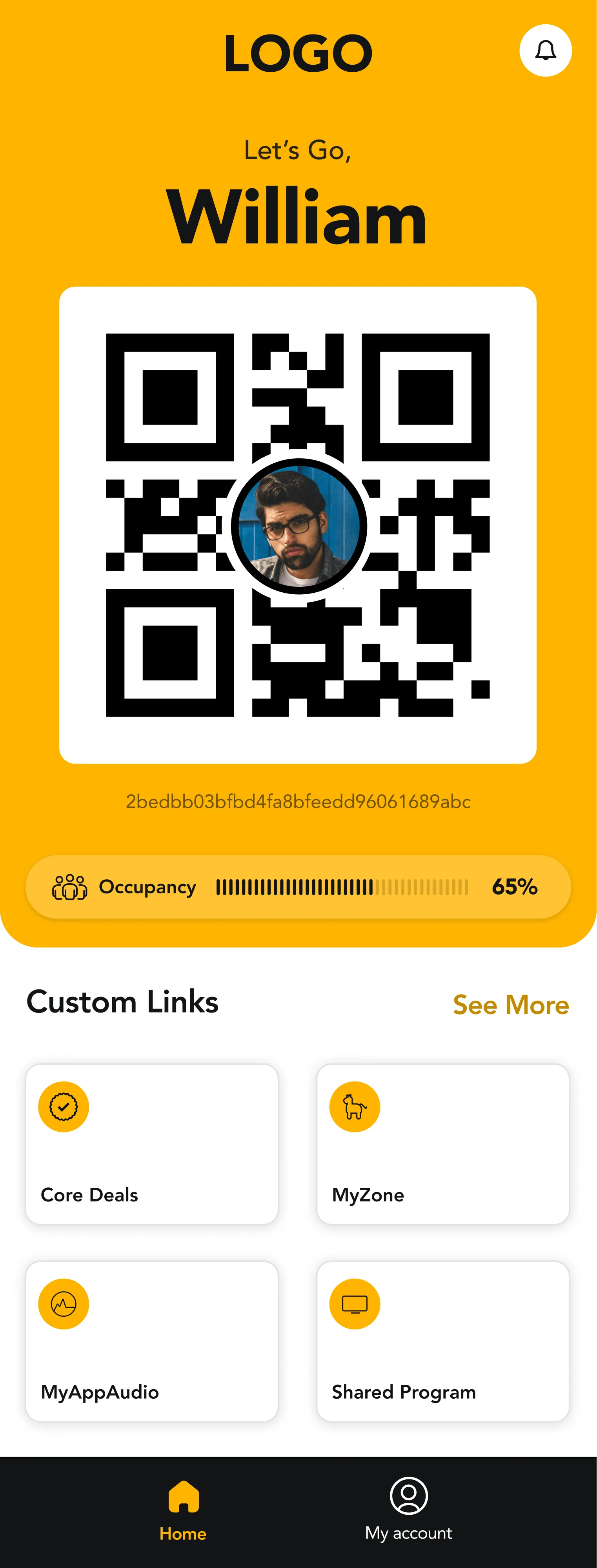
Hard edges, precise icons, strong typefaces — bold and performance-driven
The initial plan was to establish a base style, map the app architecture and wireframes, starting with the most complex version — Engagement Total. The design system would then be completed and applied to all elements, allowing adaptation to simpler versions.
Due to time constraints and immediate user demand, the business decided to begin with the simpler version: Engagement Go.
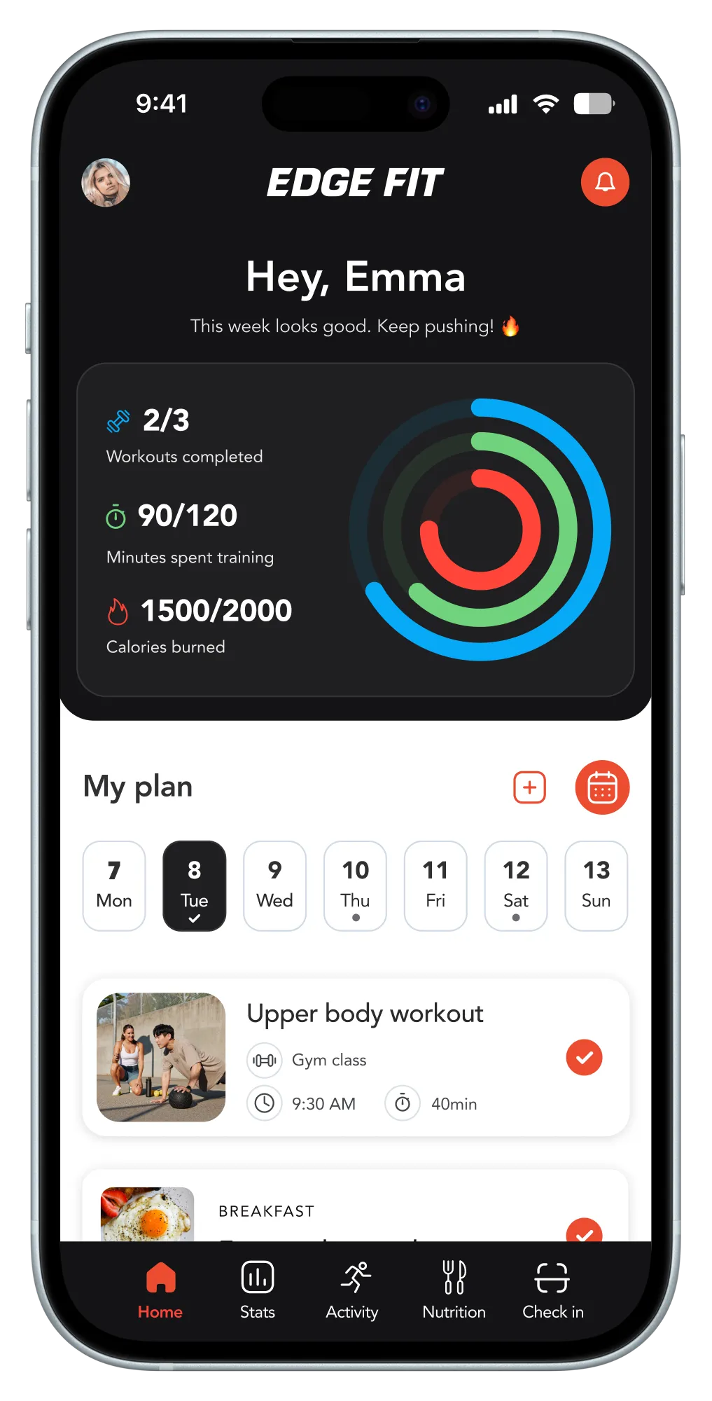
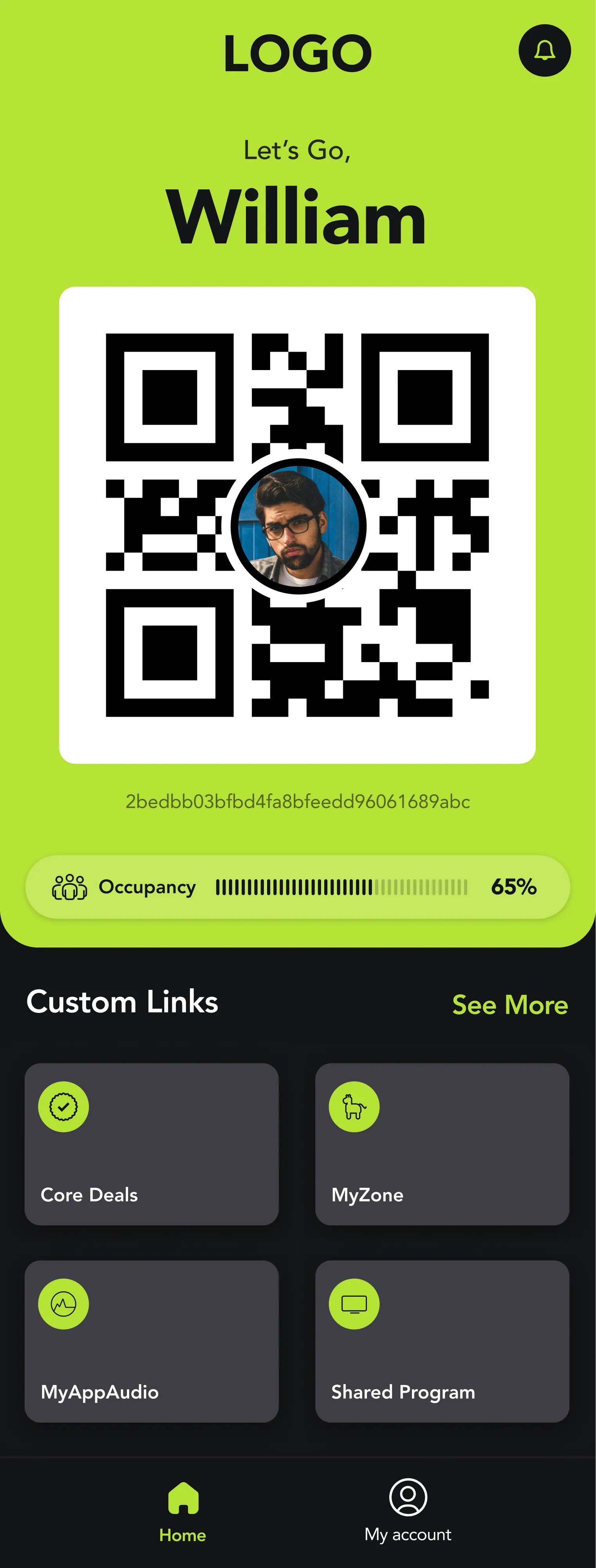
The redesign was first implemented on the basic app version — Engagement Go — primarily used by members for check-ins and membership management.
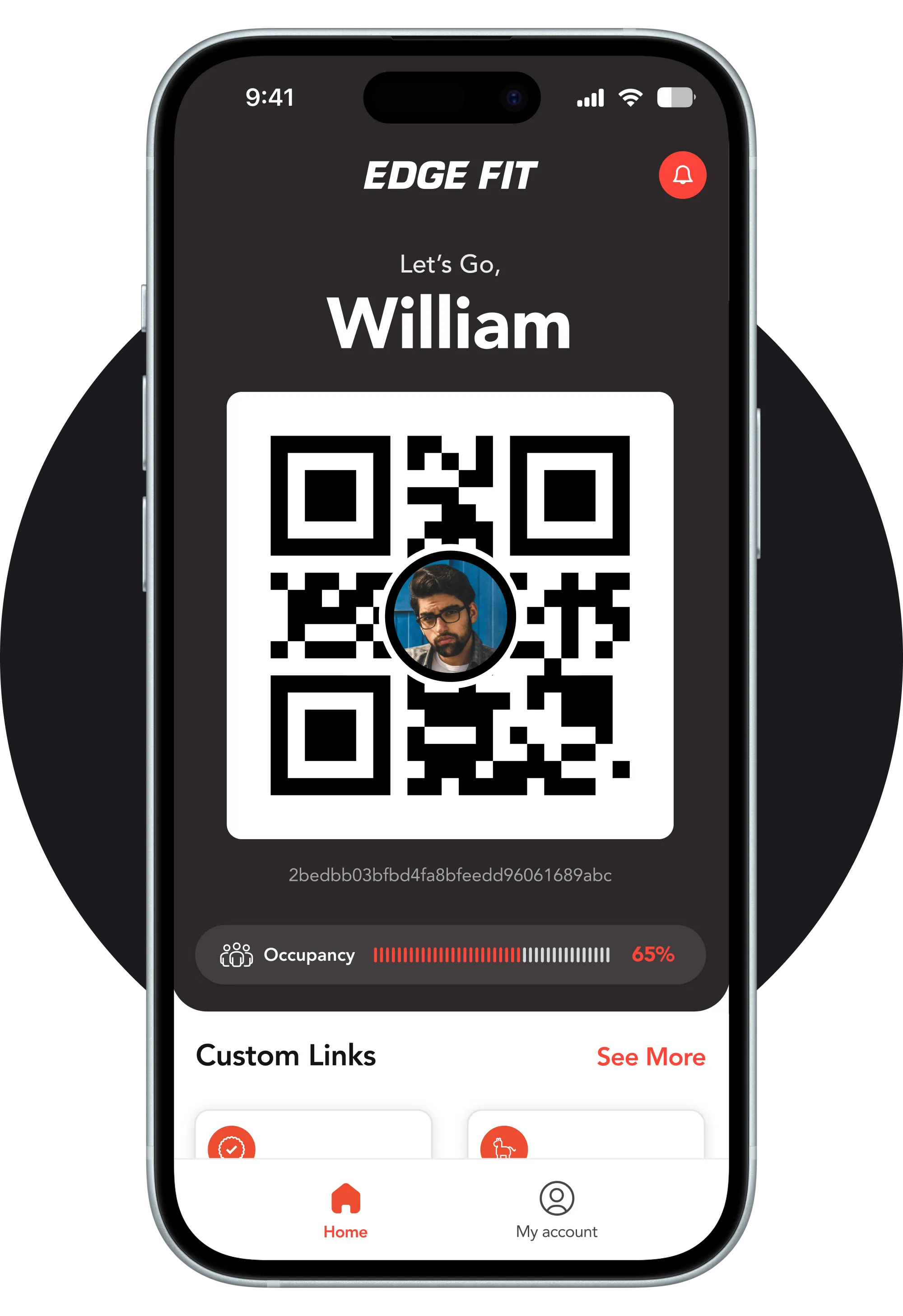
Start simple. Ship fast.
How Might We?
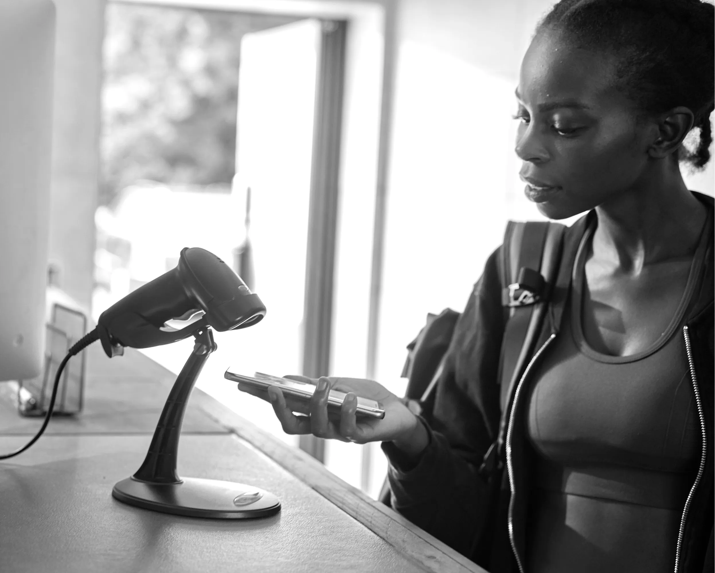
...streamline the check-in process to allow users to confirm their gym attendance with just a single tap, minimising steps and time required?
...tailor the check-in experience to individual users, providing personalised suggestions or greetings?
...motivate users to check in consistently, promoting a regular gym routine?
...design the app to be more accessible, catering to users with different abilities or needs?
...integrate a gamification element into the check-in process, rewarding users with points, badges, or challenges to create a more enjoyable experience?
...enable users to monitor real-time gym occupancy, ensuring a seamless and informed experience while planning their workouts?
...design a goal-setting feature that allows users to easily set and track their weekly check-in targets, with motivational feedback and rewards for achievement?
...design an intuitive membership management feature allowing users to renew memberships and make payments directly through the app?
...seamlessly integrate the app with popular health platforms like Apple Health or Google Fit, synchronising data to provide a holistic view of their wellness journey?
After brainstorming sessions and defining HMW questions, we did feature prioritization where we evaluated all possible features that we have for this app and listed out the most important features that we have to create for our MVP Product.
A seamless, easy-to-use check-in feature with a personalised look and feel — and the possibility of adding it to the Apple Wallet, so members can check in simply by pressing the side button.
- Monitor real-time gym occupancy
- Manage memberships
- Add to Apple Wallet
- Set a weekly goal and track number of check-ins
- Incorporate gamification elements around goal completion
- Integration with Apple Health or Google Fit
Wireframes
To identify all areas for improvement, we mapped the architecture of the current app and began reconstructing wireframes with necessary adjustments.
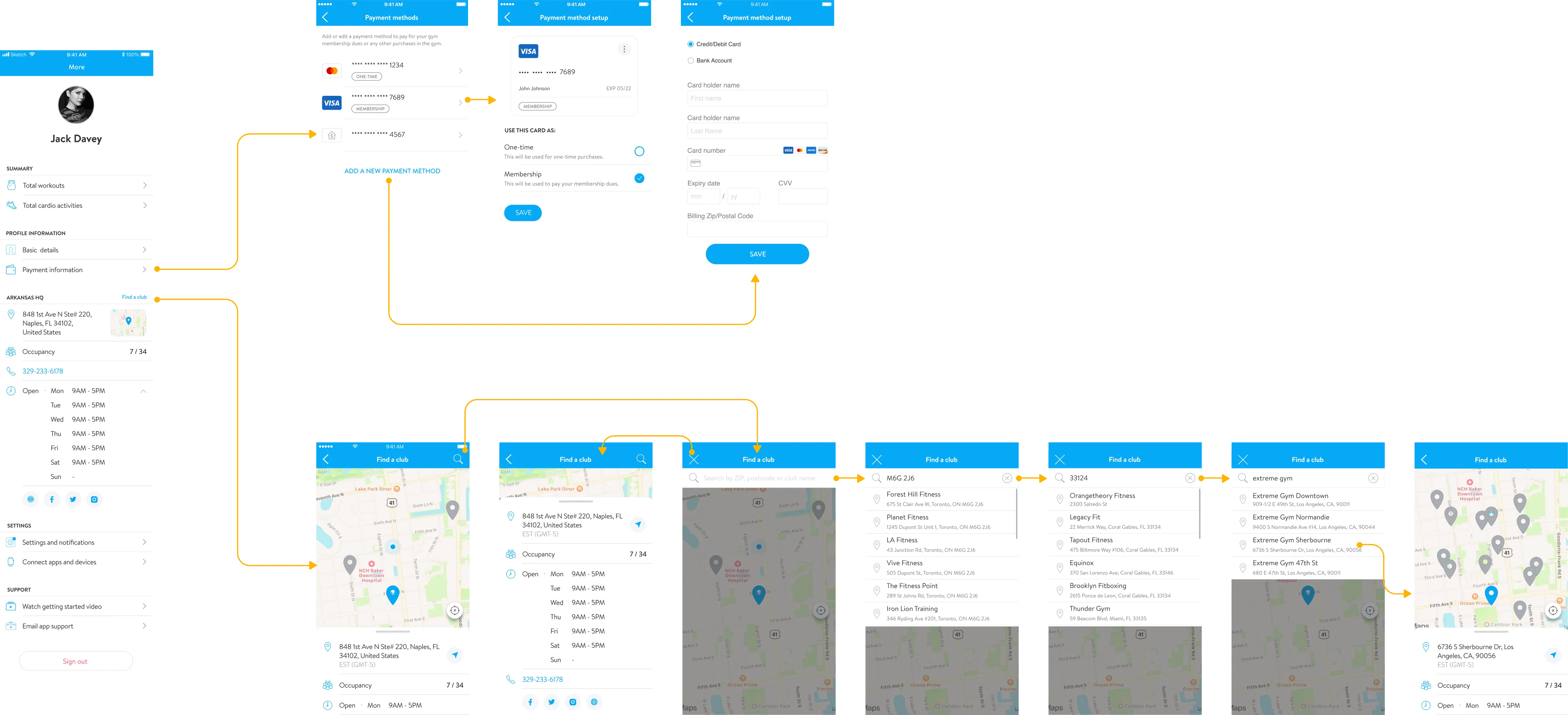
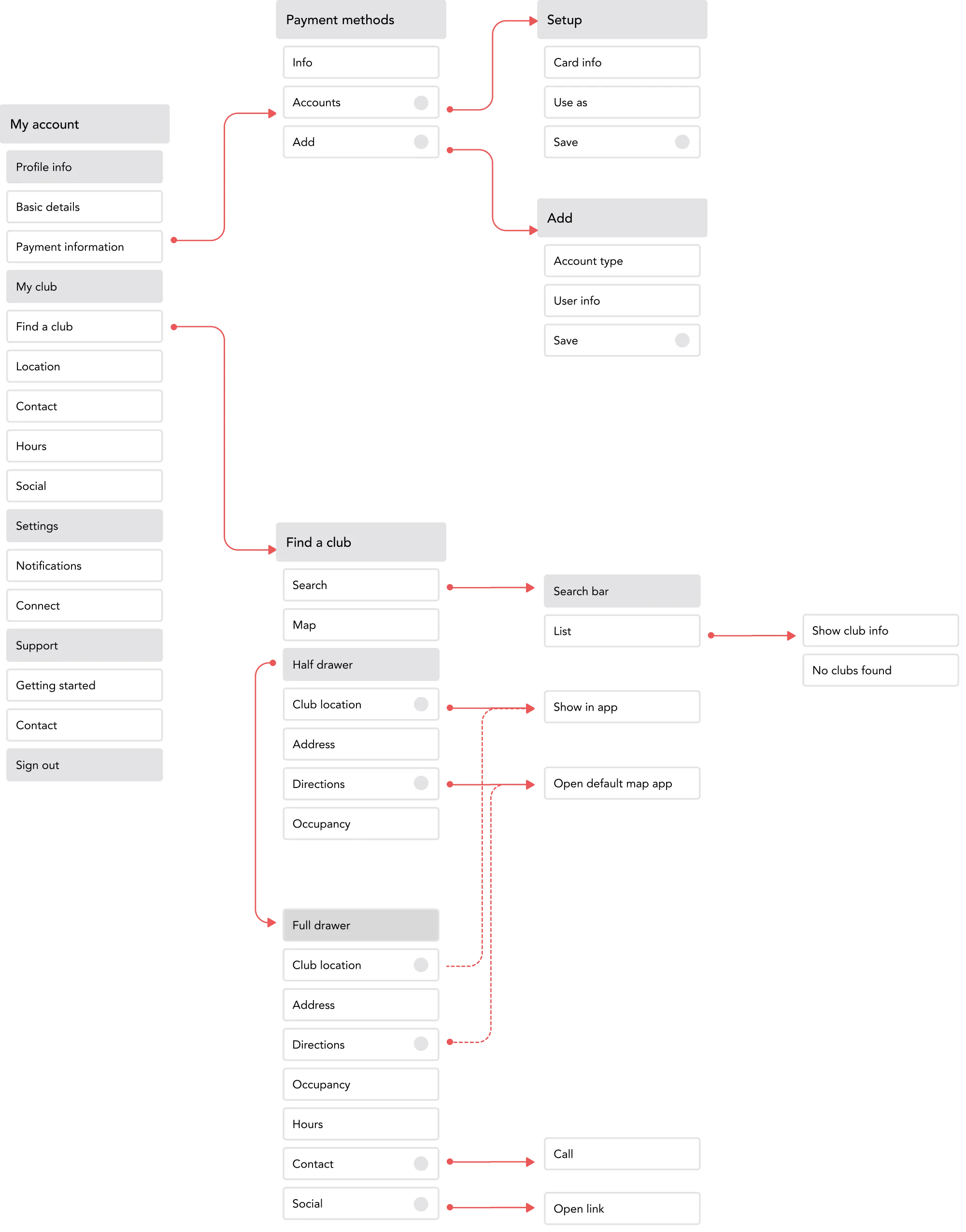
Example 1 — "Find a club" UX & UI
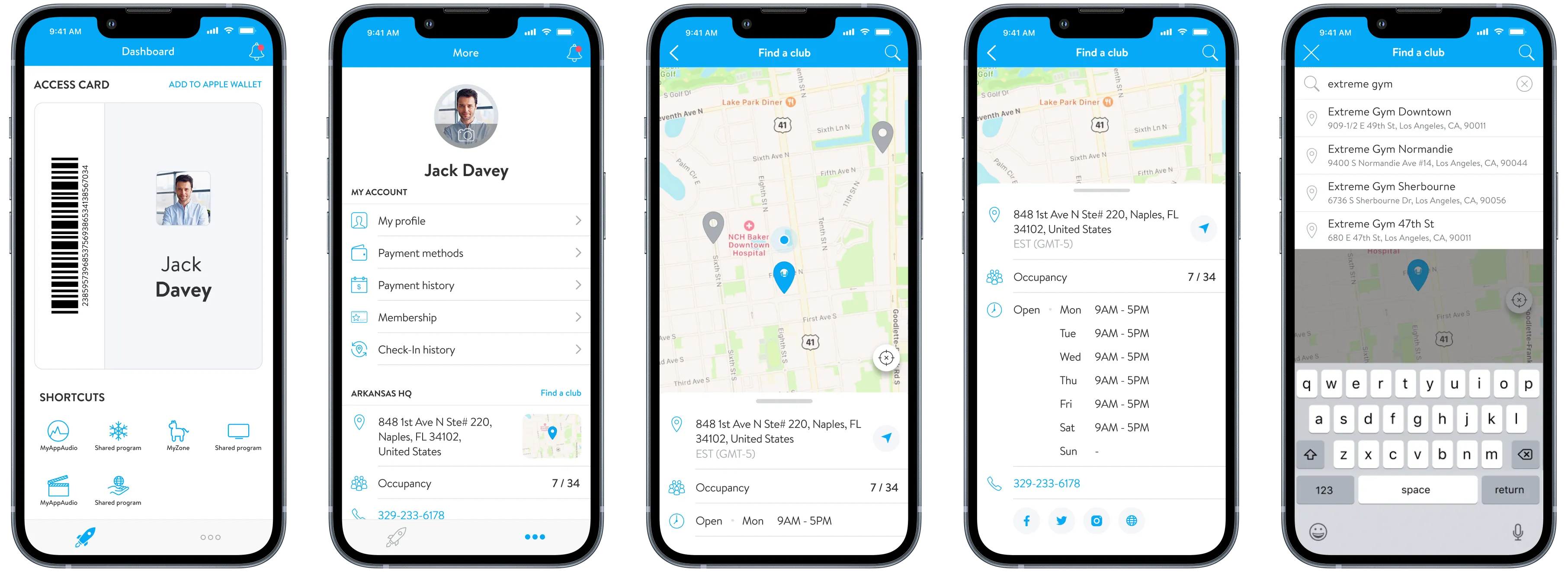
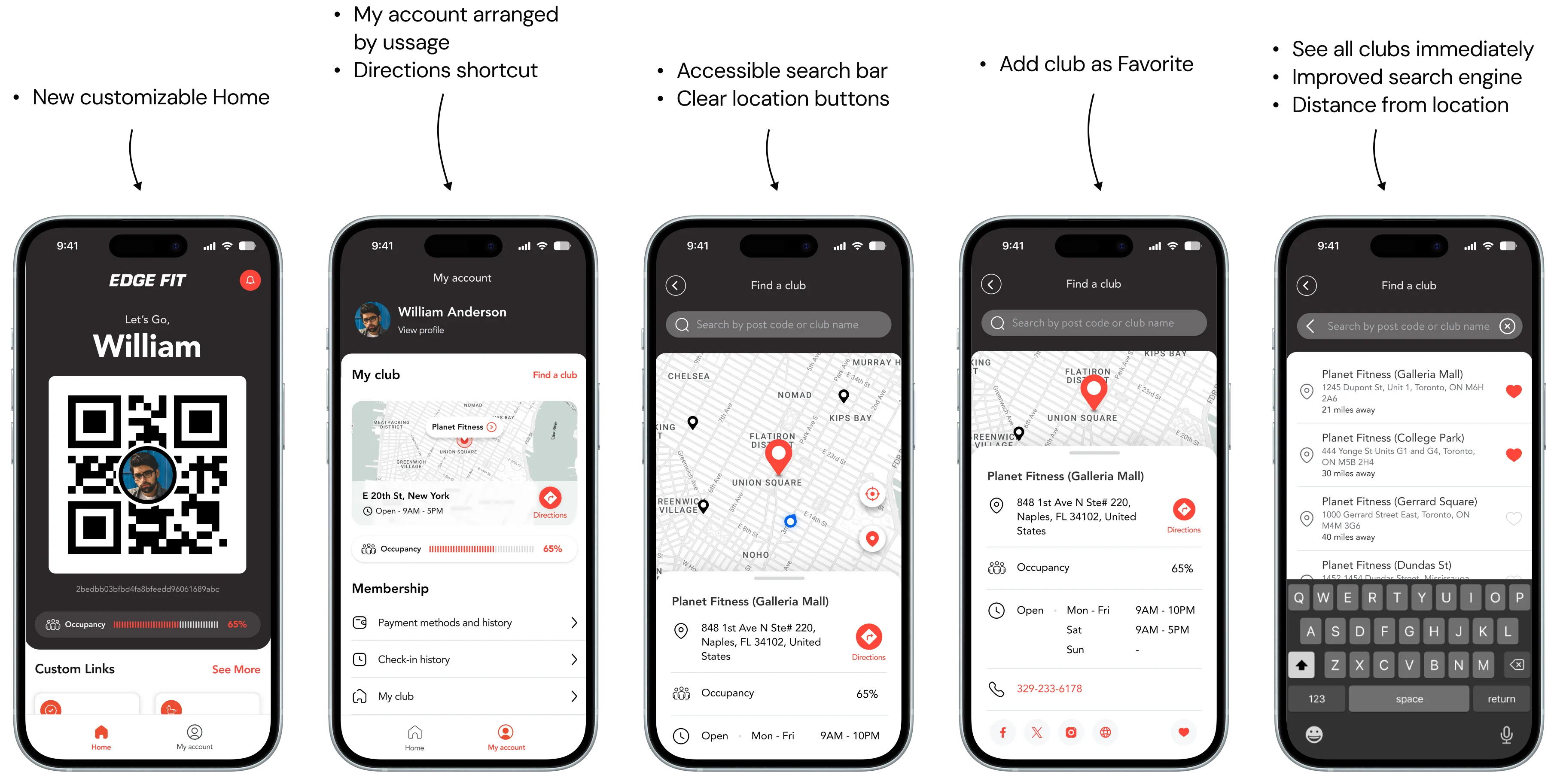
- Get directions easier — users expected a quick way to switch to their default map app
- Club name added to list results
- Distance to club displayed
- Club can be marked as Favourite
- More comprehensive icons matching UX standards, with additional actions
- Selected location centralised on map
- Improved search — whole list of clubs presented by proximity as soon as search bar is selected, then filtered as user types
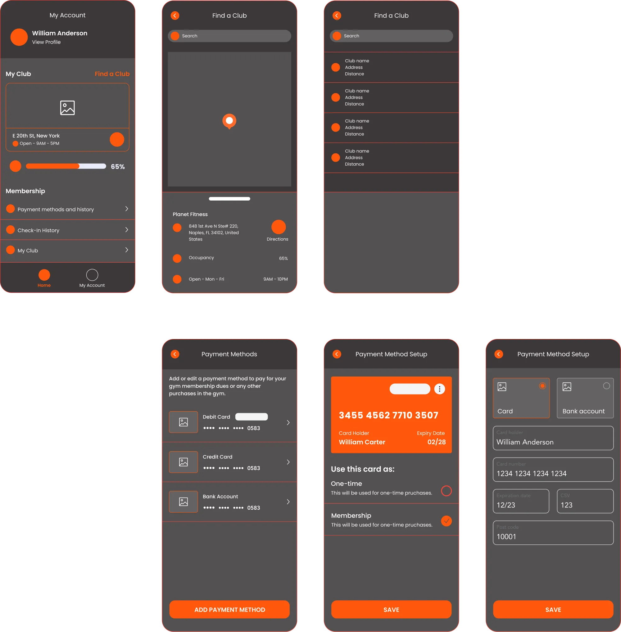
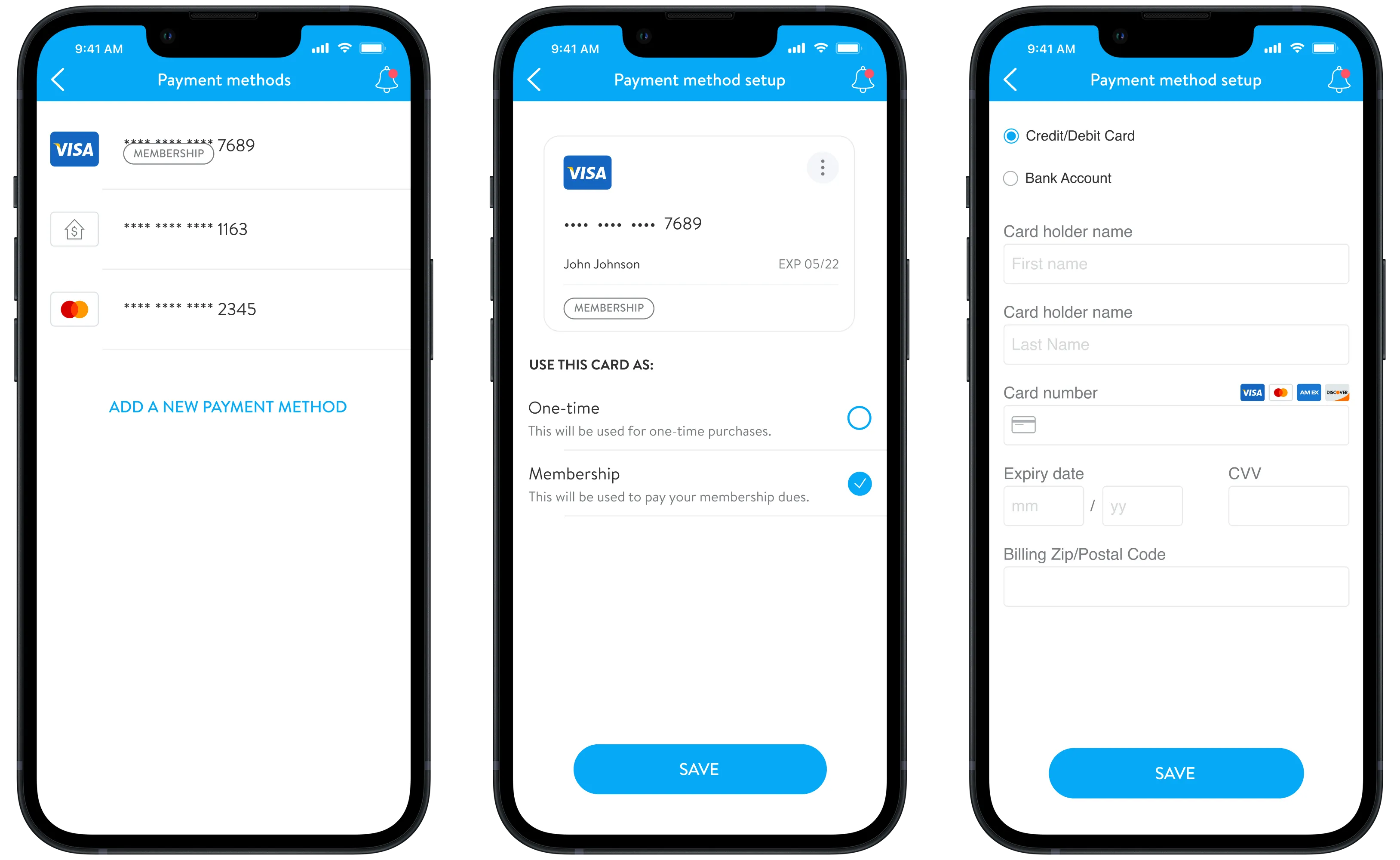
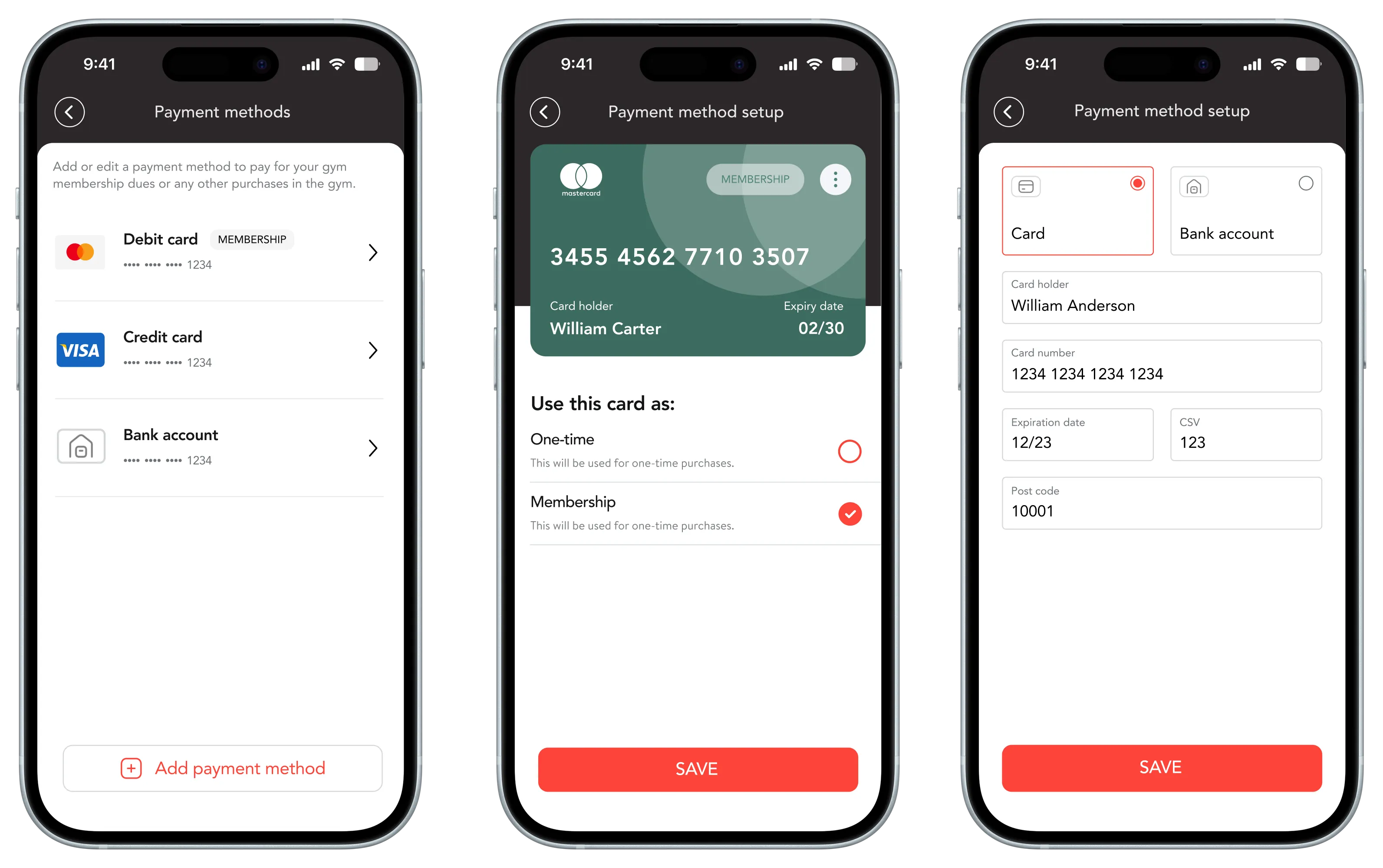
Example 2 — "Payment methods" UI
The full picture.
After establishing the visual concept through Ignite Go, we advanced to the app's most complex version — Ignite Total — containing all available features: workout tracking, class booking, nutrition logging, personal training, and more.
The project was put on hold before its completion.