Timeless elegance,
exceptional craftsmanship.
The collector's digital companion.
Add to Collection
Enabling collectors to build a private in-app overview of everything they own. Watches and jewellery added piece by piece, attaching documents and photos, and tracking the full service history of each piece: insurance policies, CPO sales back to Bucherer, repair shipments, and more.
Watch Market Value Tracking
Giving collectors and enthusiasts real-time insight into market movements, interest alerts, and watch valuations, building a feature set that rewards investment in the platform.
E-commerce Experience
Designing the end-to-end shopping journey for one of Europe's most distinguished luxury watch and jewellery retailers, translating heritage brand codes into a quiet, frictionless digital language.
Notification Center
Designing a smart notification system and interest-alert layer that keeps high-value clients informed without interrupting the silence that luxury demands.
Accessibility · WCAG
Establishing scalable, WCAG-aligned accessibility standards across the platform, proving that inclusive design and luxury positioning are not in conflict.
Swiss Apps Awards '25
The work was recognised with two Bronze awards at Swiss Apps 2025, Design and User Experience, one of the leading digital product awards in Switzerland.
The full case study is on its way — precision takes time.
This is the most recent and ongoing project in the portfolio. The documentation is still being put together. In the meantime, two key features are documented below.
Bucherer's ambition has always been to offer exceptional, personalised service, not just at the point of sale, but throughout the entire ownership journey. Customers were expressing a clear need: a single place to manage what they owned, track service history, and stay connected to Bucherer after leaving the boutique. At the same time, the business saw an opportunity. A feature that gave collectors visibility over their collection would also give Bucherer visibility over their customers, enabling the company to identify trends, understand preferences, and deliver genuinely personalised offers rather than generic outreach.
Add to Collection gave every Bucherer customer a private digital home for their pieces, watches and jewellery alike. Collectors could import existing CRM entries or add manually, attach purchase documents and personal photographs, and manage the full lifecycle of each piece: insurance policies, CPO sale enquiries back to Bucherer, and repair shipments. The research process included interviews with sales staff, direct user interviews, and persona workshops, giving us both the front-of-house perspective and the collector's real mental model. A/B testing was used to validate key flows before rollout.
Sales people know the customer best.
Before writing a single user story, we interviewed Bucherer's in-store sales staff. They spend hours each day with collectors, understand the language they use, the anxiety around documentation, and the pride of ownership. That perspective shaped the information architecture before any user research began.
Personas grounded in real collector behaviour.
User interviews revealed a clear split: the active collector who tracks every piece meticulously, and the casual owner who wants reassurance without complexity. Both needed to succeed in the same flow. Personas guided every prioritisation decision: from what to show on the empty state to how much detail to surface on the collection overview.
A/B testing for comprehension, not conversion.
We ran A/B tests across two distinct UX flows, not to optimise a funnel, but to understand which approach users actually grasped. The question was never which flow performed better on paper, but which one felt intuitive without explanation. Watching users navigate both variants revealed where mental models broke down and where the design was asking too much, informing the final flow directly.
Results exceeded expectations and were growing at approximately 7% month-over-month. The collection saw strong adoption across both piece types. Consistent with Bucherer's core business, watches led significantly. Jewellery was always a secondary market for the company, and the numbers reflected that as expected.
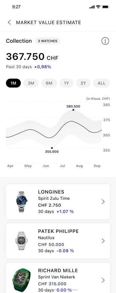
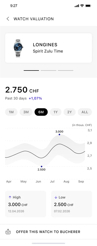
Market Value Estimate became one of the most visited features in the Bucherer app. It gives collectors a live view of their watch portfolio's estimated value, tracked over time. The real design challenge wasn't the data itself, it was the emotion around it. Watches are rarely just investments. They are gifts, milestones, things passed down. The feature had to be honest without being alarming, useful without being cold, and always feel like something Bucherer, a brand inside the Rolex Group, would stand behind.
Honest about value, careful about feeling.
For collectors, a watch is rarely just an asset. It can be a gift, an heirloom, something saved for over years. For the business, associating negative feelings with valued pieces would work against everything the brand stands for. We removed red from the value tracking palette and chose not to use downward arrow icons when a value drops. Changes are communicated through neutral tones and subtle cues, without alarm.
Readable across every timeframe.
A chart showing 10 days of data looks very different from one covering two years. Curve density, label spacing, value granularity, all of it had to adapt per timeframe while the experience stayed visually consistent. Six timeframes, each with its own display logic, none of them feeling like a different product.
Data-heavy, but still Bucherer.
Most financial dashboards are designed around density. This one had to feel quiet and precise, in line with a brand that chooses restraint over noise. Every number, label, and interaction was reduced to what a collector actually needs to know. Nothing decorative, nothing unnecessary.
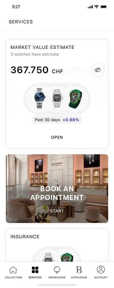
Entry point from Services
Total collection value
Per-watch breakdown
The feature was designed across seven distinct states, from the standard interaction view to empty states for users with no watches or no available estimate. Each one was given the same care as the main flow, because edge cases are where composure matters most.